PROJECT SHOWCASE | Insight

On this page we invite you to look at what we thought are just a few of the more interesting work as a shining example of our day-to-day capabilities. Clear, simple and memorable brand ideas that are succinctly told and beautifully expressed. Some illustrate brand architecture, where structural issues have almost driven the creative, others are good examples of effective and resonating brand communications that just work. All in all, we love what we do and are proud of it. Continue reading

 

PROJECT SHOWCASE | Belle Property – At home with Belle Property

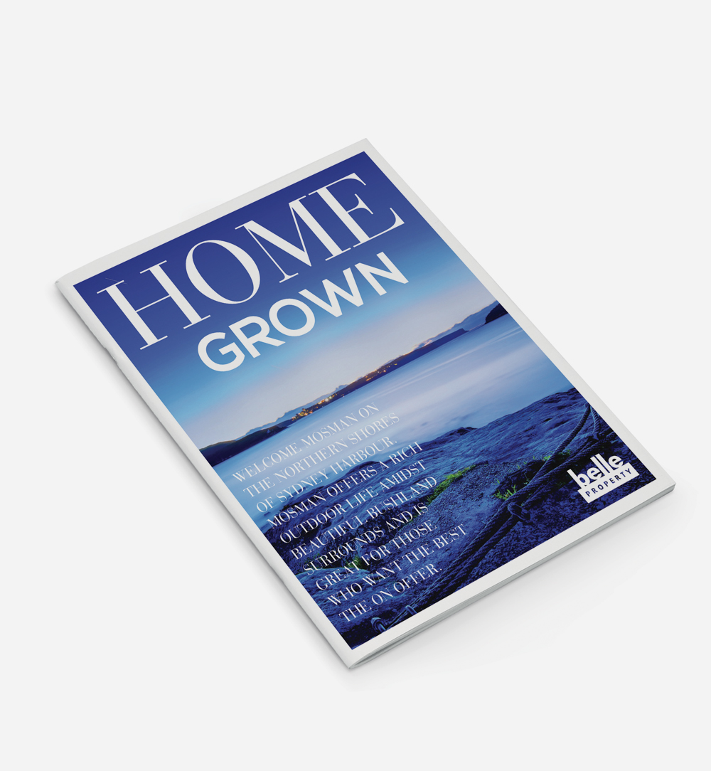
In brand terms, if McGrath represents the ‘science of selling’, then Belle represents the ‘art of selling’. This was the outcome of a thorough brand analysis, new brand evolution and campaign for the rapidly growing network undertaken recently. “At home with Belle Property” is feeling comfortable, at ease and assured. Underpinning this brand essence are the many tactical prospecting and listing tools enabling agents and offices alike to stay in touch and better engage with their buyer and seller markets. Continue reading

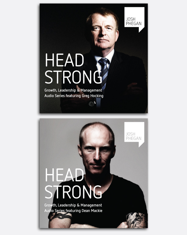
PROJECT SHOWCASE | Josh Phegan Branding

PROJECT SHOWCASE | Cobden & Hayson

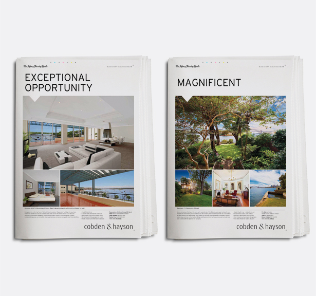
2012 marks a new era for Cobden & Hayson, now selling more than double the number of properties than the nearest competitor and achieving almost 40% market share. Over the last seven years, Justin Marden has continually been tweaking and manicuring this brand into the formidable agency it is today. Professionalism, innovation, pragmatism, knowledge and integrity – these consistent values set Cobden & Hayson apart from the competition. This year Justin created a new look and feel for their property marketing – direct, fresh and elegant, abreast of any other in the market today. Continue reading

PROJECT SHOWCASE | Lindt & Sprüngli

Justin started work on Lindt’s world first Chocolate Concept Store, located in Sydney. To date, Lindt has multiplied this concept with six flagship stores in Sydney and Melbourne. Justin was commissioned to create this unique ‘Connoisseurs’ brand within the existing retail Lindt brand we know so well, and roll out the new concept across packaging, uniforms, signage and marketing livery. Continue reading

PROJECT SHOWCASE | Agent Campaign

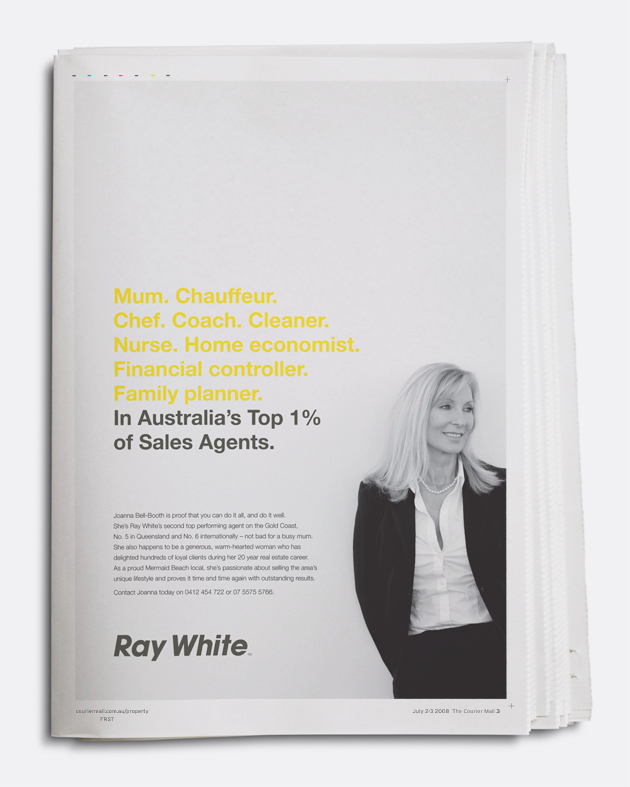
Joanna Bell-Booth is proof that you can do it all, and do it well. She’s Ray White’s second top performing agent on the Gold Coast, No. 5 in Queensland and No. 6 internationally — not bad for a busy wife and mother. She also happens to be a generous, warm-hearted woman who has delighted hundreds of loyal clients during her 20 year real estate career. This single advertisement was a one off for Joanna, but its effect has had a resonating influence on her marketplace, how she is perceived and best of all, on her bottom line. Thought of as putting the person back into selling, this is an example of an advertisement that doesn’t ask for anything. It is one of the best examples of successful agent awareness advertising ever created for Ray White. Continue reading

PROJECT SHOWCASE | ‘Did you know’ Corporate Campaign

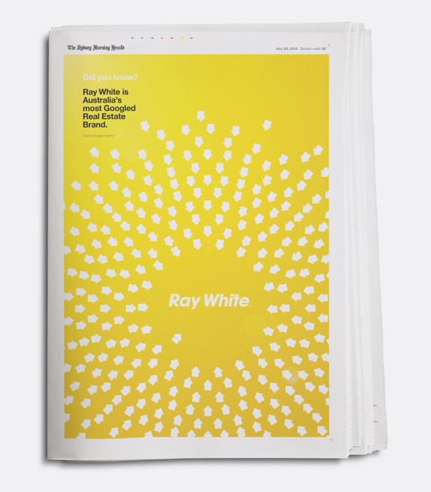
Did you know that Ray White is the most googled real estate brand? Or that Ray White generates over 53,000 email enquiries on realestate.com.au? Following the successful roll out of the new Ray White Identity, we were tasked with creating a campaign of awareness and prospecting tools. One of which was the “Did you know?” campaign that gave a voice for all levels of the group to actively engage the market. In this case, this corporate advertisement represented the Ray White’s size and influence as the largest real estate brand in Australasia, where by evolution of the brand has positioned Ray White at the forefront of understanding opportunities in the property market. Continue reading

PROJECT SHOWCASE | Website Launch

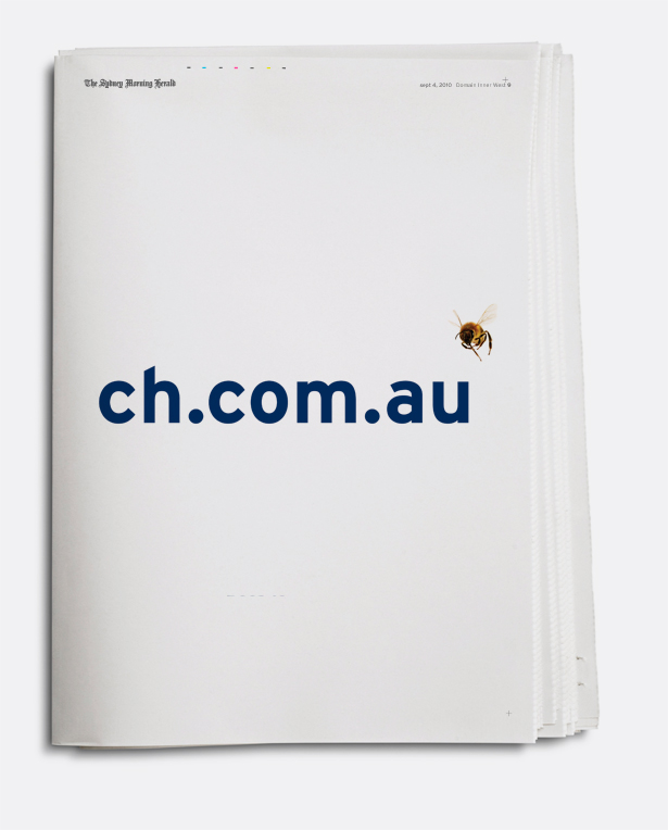
In 2010, Justin Marden redesigned the Cobden & Hayson website which marked a radical shift in real estate website design as it profiled the activities of those looking to buy and rent above all else. As the areas largest seller of properties, Cobden & Hayson and its website proved to be ‘the very best’ fountain source. An idea encapsulated by this awareness Midweek Sydney Morning Herald full page advertisement promoting the address. Like bees to honey. Continue reading

PROJECT SHOWCASE | Ray White

Ray White, Australia’s largest real estate group, needed a fresh image that would have the support of their extensive franchise network. Justin was commissioned to unearth brand mis-alignments and provide insight into the possibilities of ‘what could be’. The result, new identity that could provide impact on the street and appeal to a broad market base, from prestige to regional markets. The project called for a new look and feel, along with a new level of brand architecture, an entire new library of marketing and identity tools that covered everything – from property marketing templates and signage, to agent marketing campaigns. Continue reading

PROJECT SHOWCASE | Kennards

As can happen with established companies that are both large and successful, Kennards Hire’s identity had become tired and dated. The brief was to create an identity abreast of the times and that could be applied to everything from ‘ladder to loo’. The largest component was the application of the new brands’ internal and external signage system. The project was complete in under 18 months across 170 stores. Continue reading