BRAND COMMUNICATION | Insight

In a world dominated by social media, texting, information overload and ever-shrinking attention spans – getting your message across can be a challenge. Creating compelling content that informs, enlightens and inspires is at the heart of our process of great brand communications. The medium changes from project to project, but the elements of good design remain the same. What is the objective? Who is the audience? What are we communicating? What is the overall visual personality? At Studiomardo, we solve these problems every day with authority, clarity and unswerving attention to detail. Over the years, we have helped companies across many industries communicate good ideas. Great execution is the core of what we do. Continue reading
BRAND COMMUNICATION | Thomson – Prospecting Brochure

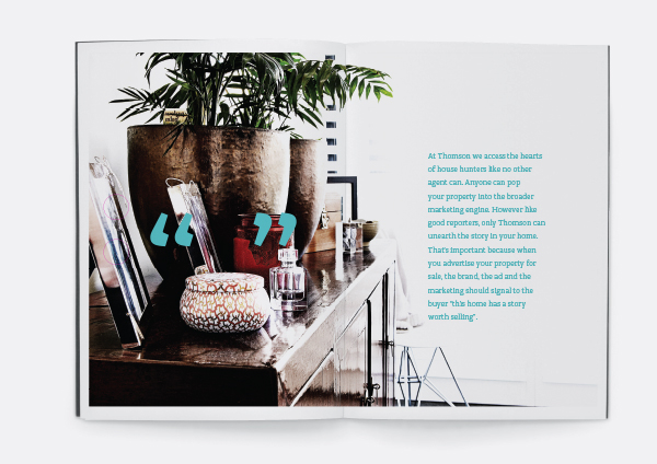
With the recent re-brand of Thomson, one of Melbourne’s most respected real estate names, we delivered a truly better presentation of brand confidence. We helped Thomson access the hearts of house hunters like no other agent could. We delivered a promise that only Thomson could – unearth the story in each home. Because when you advertise your property for sale – the brand, the agent and the marketing – should signal to the buyer, “this home has a story worth selling”. Continue reading

BRAND COMMUNICATION | Philip Webb – Always

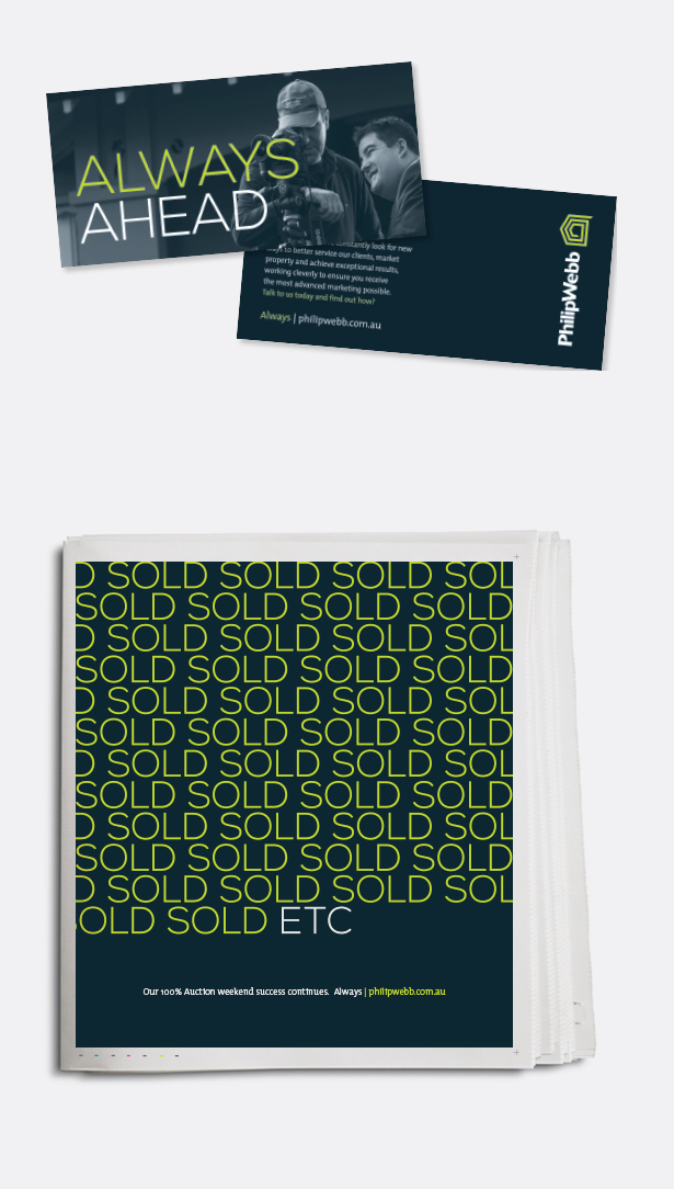
In July 2013 PhilipWebb Real Estate launched a new corporate brand into the market. The brand was designed with a newly refined colour palette and a cleaner, simpler approach throughout all marketing executions. Part of the cleaner look and feel is the use of ‘negative’ space against which to contrast the brand. All copy, whether for the agency, for property, or for team members, has been kept to a minimum, as this is what the target audience have told us they want. The overall relaunch campaign for the business uses the umbrella positioning “Always PhilipWebb”. The concept not only recalls and relies upon a 40 year track record, it reminds the market of ongoing success and commitment to innovation, market experience and delivery of outstanding results, but it also looks forward to always being ‘here’ and continuing to provide the same. Continue reading

BRAND COMMUNICATION | PhilipWebb – Web Campaign

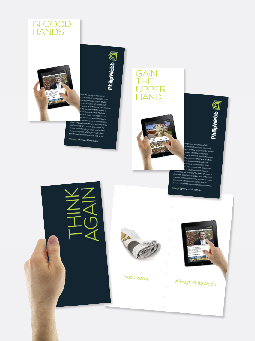
We helped PhilipWebb take the lead and not follow the trend. A spearhead campaign for PhilipWeb was – effectiveness of web marketing versus print, called “Sooo 2009”. It considers a basic proposition that the buyer community are no longer using print in the same way as they have in the past. That over 80% of buyers use the web as their primary vehicle for searching for property etc. The campaign promotes PhilipWebb’s tailored campaigns that maximise market penetration and achieve exceptional prices while keeping marketing costs to a minimum. Continue reading


BRAND COMMUNICATION | 2011/12 Campaign

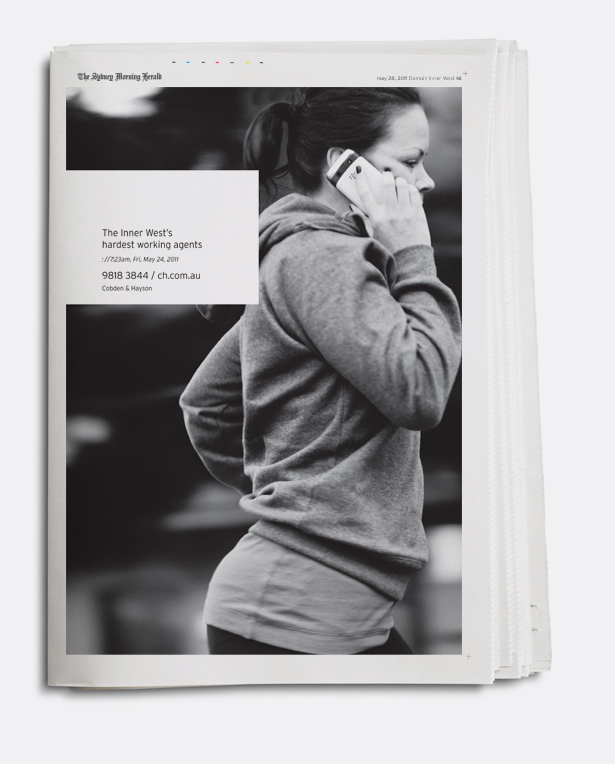
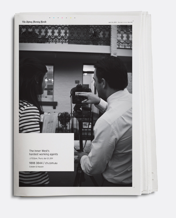
Each year we have the task of creating a brand awareness campaign of 12 advertisements for Cobden & Hayson. The challenge to create a compelling campaign that is something new each time, is only made more difficult by a modest budget. Luckily though, after being behind the brand creation for seven years, Cobden & Hayson has carved quite a formative style, which helps makes things a little easier. Continue reading

BRAND COMMUNICATION | Laing + Simmons

For our real estate industry clients, it has and always will be our aim to improve the way agents brand & market themselves. Our ability to deliver hard-working solutions that address agents true needs, stems largely from the fact that we interact daily with more of the top ten percent of businesses than any other design firm. Being actively involved inside multiple companies both large and small. The most recent project for Laing + Simmons was no exception. We created the most comprehensive consolidated agent marketing campaign project seen in recent years. An entire suite of bespoke tools that allow every agent within the group to look as one and grow as individuals. Above all, energise and expand every individuals’ prospecting endeavours and move beyond the present. Continue reading

BRAND COMMUNICATION | Luton Property

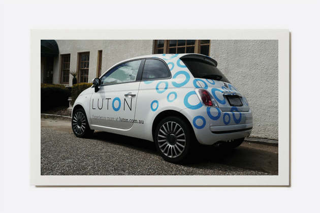
Luton is Canberra’s largest privately owned real estate business, boasting a network of seven offices. On the cusp of future growth, our task was to rebrand the company and rekindle local love and attention for this much awarded business.
The company name Richard Luton Real Estate was shortened to Luton and an entirely new identity and toolkit of elements was created. The circle was the centrepiece of the new logo design, symbolising wholeness, oneness, completion, perfection and well-roundedness whilst also representing some of the companies core values – being part of a circle of influence and amongst a circle of friends.
The change had a resonating effect with the local property market, with the agency now becoming the agency of choice to sell, buy and lease, particularly gaining traction within the premium market. Continue reading

BRAND COMMUNICATION | Taylors

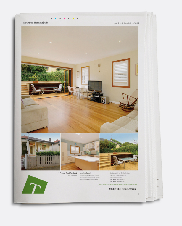
Studiomardo has worked closely with Taylors Estate Agents over the last 5 years, constantly progressing the brand, its marketing and its identity. Most recently the client set a goal to grow the companies exposure into a broader, more affluent and more competitive residential market. Part of the holistic brand campaign was the redesign of the property marketing templates. ‘Marketing not just advertising’ was the approach. Getting the prospective buyer to contact the agent and build database was the solution. As seen here, the design of the templates illustrate you can achieve a whole lot more with less. Continue reading

BRAND COMMUNICATION | eGovernment

One of the key projects for the NSW Government – Department of Information, Technology and Management (DITM) was to campaign awareness that State Government initiatives represent smart thinking. Part of the branding project for DITM and its umbrella initiative ‘eGovernment’, was the creation of the communications piece “Eg.” – a showcase of smart innitiatives within the public and private sector. Like the the strap line says ‘leading by example’. Continue reading


BRAND COMMUNICATION | North Estate Agents

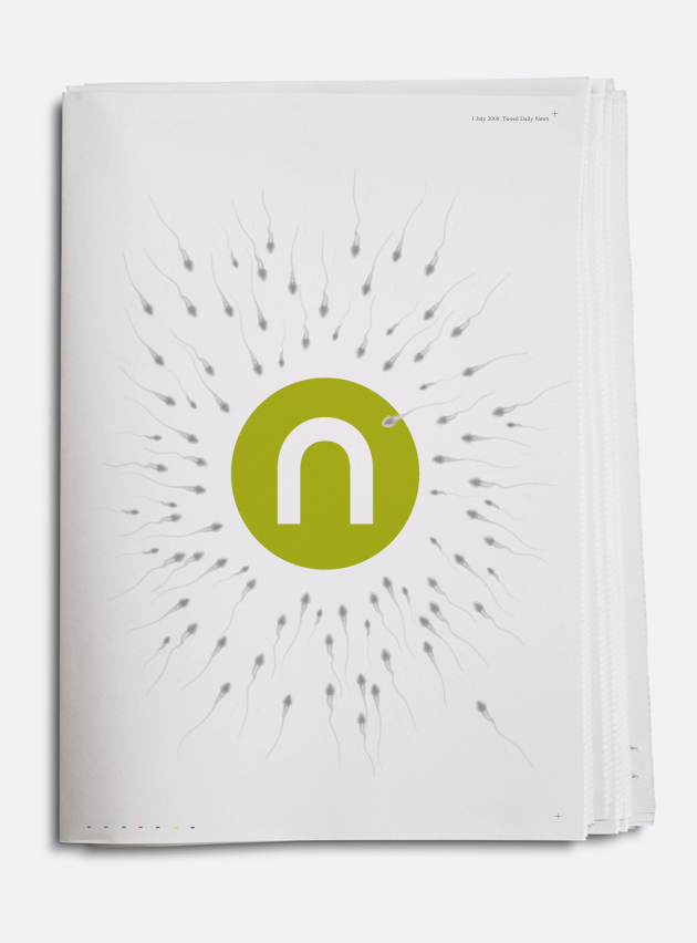
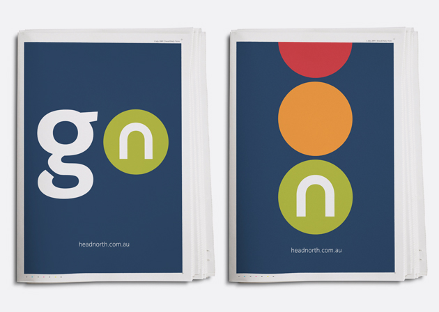
Shock of the new – When we launch a rebranded company, we expect to collar the right impression and capitalise from the awareness. So it was with North Estate Agents, formerly Raine & Horne Tweed Heads. The marketing of the new North brand was by far and away unlike anything the local market. It was a radical departure from the commonplace estate agent humdrum. This series of tease ads ran upon the launch of the new brand. The goal was to introduce the brand as refreshingly different and garner hearts and minds for what was to come. Continue reading

BRAND COMMUNICATION | Kennards

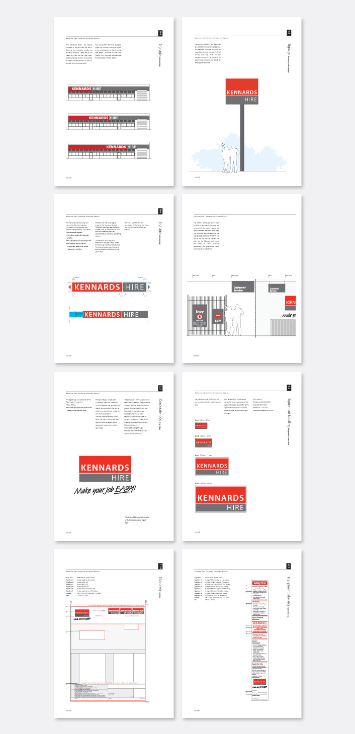
After extensive research with the buying public and Kennards Hire staff, the conclusion was important – to rebrand and create a new identity that gave weight to the name Kennards, along with an impetus of trust and cleanliness. The result was an 18 month project that touched every aspect of the company. From staff training, to signage. The rebrand project was a big investment for Kennards. Essential to the program being implemented to strategy, was the creation of the Kennards brand manual. The manual helped standardise the behaviour and look of all stores, helping make Kennards Hire one of the most recognisable Hire companies in Australia. Continue reading


BRAND COMMUNICATION | LINDT & SPRÜNGLI

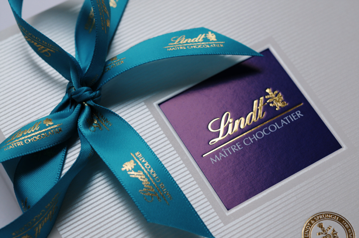
The chain of Lindt Concept Stores were the first of its kind in the world, offering a selection of fine chocolates, pastries, cakes and ice-cream, all made using chocolate from Lindt of Switzerland. The critical task for Studiomardo was the branding of Lindt’s newest offering, the premium ‘Connoisseurs’ Selection’, a luxury range of chocolates created by Lindt’s Maître Chocolatiers. We were bestowed with the role of brand custodian, designing and managing the implementation of Lindt’s Concept Store brand and all its products. Working closely with the brand steering committee, we touched on almost everything, from art direction, signage packaging and brand marketing. Continue reading


BRAND COMMUNICATION | LINDT & SPRÜNGLI

An unfortunate by-product of designing for Lindt, was the cutting of a new hole in our belt, literally. But like all worthy design projects, the best inspiration comes from enduring the deepest understanding of the client and it’s products. The Connoisseurs Collection is a locally hand made Swiss chocolate, quite unlike any other. The design for the range of chocolate boxes and ballotins is a testament to simple design embellishment and a showcase in simple yet regal honesty. Naughty but nice. Continue reading

BRAND COMMUNICATION | Ray White

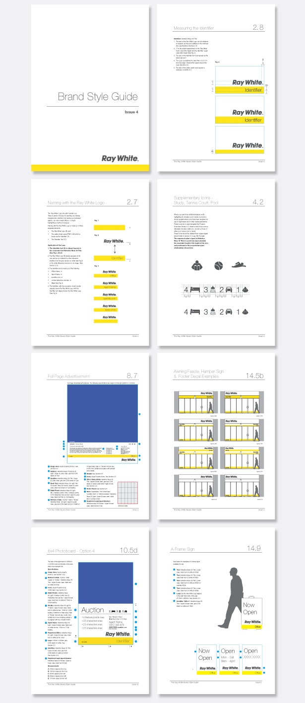
Probably one of the most thorough and comprehensive corporate standards guides was the one developed for Ray White as part of the rebranding project. The brand steering committee decided to create a set of standards so complete that the guide became the ultimate authority. Separate brand guides along with territorial specific editions were created for each business stream that included Residential, Commercial and Rural. As at 2010, the residential guide alone represents over 400 pages of standards, templates and references that detail every aspect of applying the Ray White identity for property marketing. Continue reading

BRAND COMMUNICATION | Agent Campaign

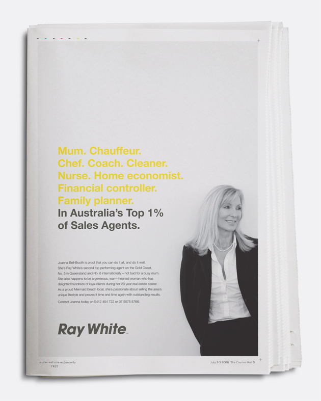
Joanna Bell-Booth is proof that you can do it all, and do it well. She’s Ray White’s second top performing agent on the Gold Coast, No. 5 in Queensland and No. 6 internationally — not bad for a busy wife and mother. She also happens to be a generous, warm-hearted woman who has delighted hundreds of loyal clients during her 20 year real estate career. This single advertisement was a one off for Joanna, but its effect has had a resonating influence on her marketplace, how she is perceived and best of all, on her bottom line. Thought of as putting the person back into selling, this is an example of an advertisement that doesn’t ask for anything. It is one of the best examples of successful agent awareness advertising ever created for Ray White. Continue reading

BRAND COMMUNICATION | Agent Campaign

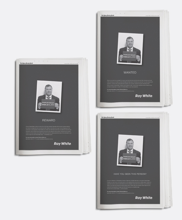
What do you want from your agent? You want a true local who knows and loves the area where you live. Someone who’s part of the community, who makes you feel comfortable and taken care of. Someone you can trust. You want someone with experience, someone who’s passionate about property, and of course, someone who gets outstanding results. What you want is a campaign that talks to you, engages with you and puts a smile on your face. The campaign of three ads for Charles Bailey is just another example of how our brand architecture created for Ray White Corporation allows agents and offices to act independently yet have the backing and endorsement of the Ray White brand and name. Continue reading


BRAND COMMUNICATION | Citi Structured Products

Justin was commissioned to articulate the CitiWarrants (the derivatives arm of Citi) market identity and design and produce a full range of brand marketing communications material. The review resulted in a rationalisation of the CitiWarrants’ identity strategy for Asia Pacific, the creation of a new advertising campaign and the redesign of all communications material including advertising, direct mail, financial reporting documents and Product Disclosure Statements. Justin looked after Citi Structured Products brand activites for over ten years. Continue reading

.

BRAND COMMUNICATION | Bresic Whitney

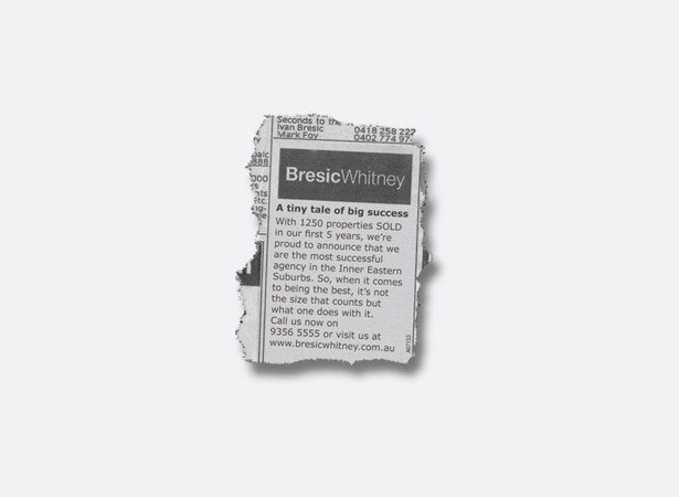
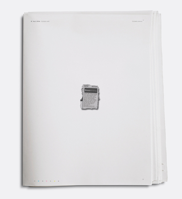
As the saying goes, from little things big things grow. With a little help from Studiomardo, in its first 5 years, Bresic Whitney – then a relatively small company in Sydney’s Inner Eastern Suburbs – managed to secure the highest results in the area. A feat made even more impressive by the companies size. Shortly after creating the identity for Bresic Whitney, we created and ran this little award winning ad, as a full page – cut out and isolated like this in The Sydney Morning Herald Domain and Wentworth Courier, for a period of eight weeks. Continue reading

BRAND COMMUNICATION | EXP Packaging

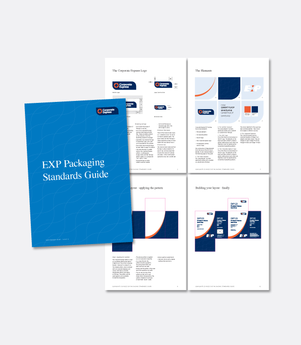
Corporate Express clients felt that the labeling of its EXP line didn’t match the quality of the products and was more aligned to a ‘Black and Gold’ brand rather than the premium product it was. To positively alter clients’ perceptions we gave EXP a new brand identity and packaging. By formulating a unified design standard that could umbrella all products in its range, we took its look and feel from a cheap house brand to a high quality range which holds its own against premium brands. Continue reading

BRAND COMMUNICATION | Cooley Auctions

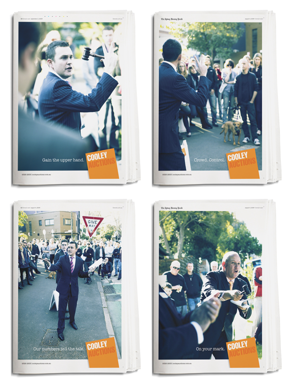
“The guys in the office know that if Justin designs something for us then we run with that. I have complete trust in his ability to keep us winning business. Our success depends on our image and how we are perceived in the market and it has been made possible by Justin Marden. I wish I had a dollar for every time a client or prospective client complimented me on our marketing. The quality is exceptional!” says Director, Damien Cooley. Continue reading