BRAND IDENTITY | Insight

When the focus of your work is identity and branding, it’s inevitable that potential clients and peers often focus in on logos. Yet concentrating on marks and symbols tells only one small part of the story. Many of our identity and branding projects can take months to get close to the visual stage, as we research, discuss and workshop the strategy with clients. In fact, much of what we do extends far beyond the creation of a logo. Great marks, just like great brands don’t become great by accident, they require thorough investigative research, insight and the clout to see them to market. Continue reading
BRAND IDENTITY | Laing+Simmons

Justin Marden spearheaded the opportunity to rebrand Laing+Simmons back in 2010. 18 months later the then directors saw the right opportunity to fly the flag of change and signal a new focus. The rebrand project detailed the perfect opportunity to align future strategic growth objectives. It consolidated Laing+Simmons’s position as the leading boutique operator in key local markets and provided the tools and support franchisees needed to build their market share and drive improved outcomes for their customers. Continue reading

BRAND IDENTITY | Coronis

Coronis is one of Queensland’s most successful independently owned real estate networks. When we re-branded Coronis, we didn’t set out to make different, we set out to make smarter. We worked closely from inside the organisation to improve their look and means of communication – articulating only the most rewarding experiences that benefit their clients. Continue reading

BRAND IDENTITY | Richardson & Wrench

One thing we have learned over the 15 years branding many of Australia’s most respected real estate brands – being successful in real estate is about more than property and great results, it’s about people. It’s about feeling comfortable and trusted. We believe that all successful real estate agents are consistently seen and known for doing the right thing, and in holding oneself to the highest standards.
In 2014 we were engaged with this insight in mind, to re-unite the offices and align the Richardson & Wrench brand under a National Brand Campaign and full suite of Agent Prospecting Tools. At the heart of our campaign was to capture the very essence of a Richardson & Wrench – driven, uncomplicated and honest. Richardson & Wrench – Keeping it real. Since 1858. Continue reading

BRAND IDENTITY | Red

Elders Manly were a dominant force in local real estate for almost 25 years. Now they have embarked on a bold new rebrand to reflect the changing market, re-launching as an independent agency – Red Property. Still the same familiar team headed by the same Principals in the same location, only now with a contemporary pitch and a more innovative approach and technology. Why the change? With a firm vision for the future, and help from us, they’re committed to tomorrow’s best practice and remaining at the forefront of the industry.

Continue reading

BRAND IDENTITY | Living Basket

Living basket provides beautifully gifted products for every day living. Their baskets have been designed in Australia and hand-made by woman from impoverished communities in Bangladash. Through the fair trade system the proceeds received from these beautiful baskets provides livelihood and sustainability for their children and extended families. Living is giving. Continue reading

BRAND IDENTITY | Bresic Whitney

BresicWhitney can proudly say they are Inner Sydney’s leading real estate agency. Since the new brand was created back in 2003, BresicWhitney have grown to become the dominant residential agency in the inner city. Upon creation of a bold brand with a straightforward sharp look, we’re comforted in knowing that we laid the right foundations for a brand the envy of many. Continue reading

BRAND IDENTITY | OneGov

One system to rule them all,
One system to find them,
One system to bring them all
and with the knowledge bind them…

Recently we worked with the NSW Government Licensing service to create an identity for OneGov. The OneGov initiative spearheads new action in building a centralised Government IT service that provides tools to manage business, occupational, recreational and community licensing from one single source. A tight budget and a 10 day time line was no set back, in fact, having the positive pressure of an optimally challenging assignment — being given an important problem to solve that no one else has been able to crack — did supercharge our intrinsic motivation and creativity. Continue reading

BRAND IDENTITY | Taylors

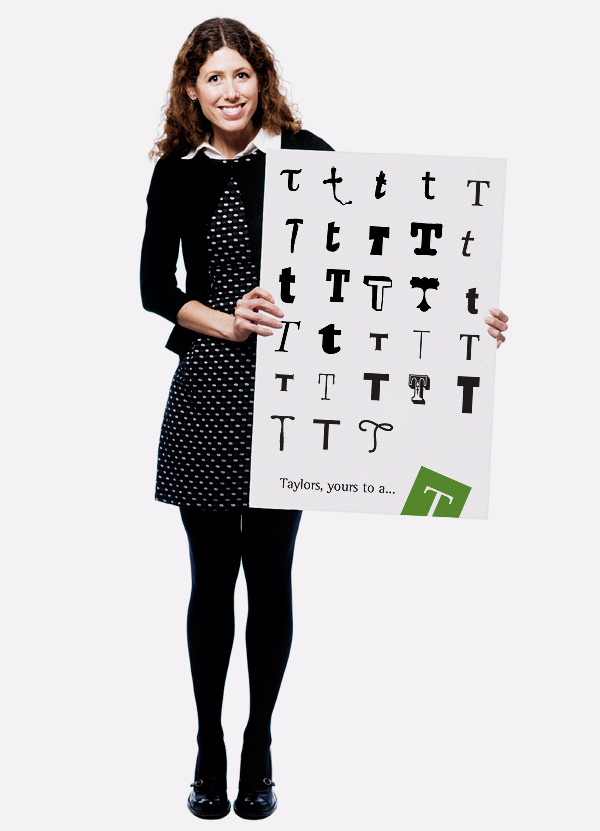
We hear it often enough ‘everyone’s unique’. At Taylors Estate Agents however, they live and breath uniqueness. Applied to every listing is a truly local and personal sensibility. Since 2007, Justin has been committed to continuously progressing and innovating the Taylors identity. Most recently, Justin created the new brand position “Taylors, yours to a…”. Complementing this development was an complete brand alignment, new website, listing, prospecting and property marketing tools. Continue reading

BRAND IDENTITY | Thomson

The Thomson brand has been evolving for 130 years and stands today as one of the most highly respected real estate names in Melbourne. With the help from us, Thomson are constantly looking for better and more innovative ways to please their clients. Intensive research factors greatly into the way we add value to our clients. Back in 2005 Justin was commissioned to energise the brand and its marketing presence. Today, we are working closer than ever to deliver something even more powerful – a whole new brand from the inside out.
Continue reading

BRAND IDENTITY | Country Road

From serif to sans serif. The redesign of the Country Road Identity (logotype) from a serif font to a sans serif font was decisively simple and yet took many years of subtle change to implement. The end result was a clear and focused brand identity for the retail giant which has grown rapidly and successfully. Continue reading

BRAND IDENTITY | Lindt & Sprüngli

Justin started work on Lindt’s world first Chocolate Concept Store, located in Sydney. To date, Lindt has multiplied this concept with six flagship stores in Sydney and Melbourne. Justin was commissioned to create this unique ‘Connoisseurs’ brand within the existing retail Lindt brand we know so well, and roll out the new concept across packaging, uniforms, signage and marketing livery. Continue reading

BRAND IDENTITY | Armonia

Another quality development for European company South Pacific. The Armonia residence project, in the heart of Bucharest, Romania was witness to a totally new standard of quality living. The 5 residential compounds comprises around 275 homes for those that appreciate distinguished architecture. Armonia is modelled on a very Australian perspective and subscribes to a relaxed, detached and clean way of life. Justin was asked to create the identity and marketing elements for the entire project. With exacting timeframes, the project was met on time and on budget, and the result was a brand and image as successful as the entrepreneurs who started the company. Continue reading

BRAND IDENTITY | Cobden & Hayson

In 2005, Raine & Horne Balmain changed to Cobden & Hayson and is now the strongest performing real estate business on the Balmain peninsula. Cobden & Hayson rose to prominence by a balance of achievements, principles, values and of course a strong brand. Our rebranding of the company, saw not only a change of name, but the visual expression of a new guiding set of principles. The new brand is independent and premium in style, a flip-side to the Raine & Horne office it was. Since the rebrand, Cobden & Hayson’s brand has been a constant innovator, employing big picture thinking, an honest commitment to budgets and year long planning. The Cobden & Hayson rebrand transported the company into a position where it can leverage its accumulated knowledge to better inform clients more than ever before. Justin’s work for the new brand has helped fuel spectacular growth. Continue reading

BRAND IDENTITY | HAL

Horticulture Australia Limited (HAL) is a not-for-profit, industry-owned company. It works in partnership with Australia’s horticulture industries to invest in research, development and marketing programs that provide benefit to industry and the wider community. The genesis of the HAL corporate identity was inspired by the seed – drawing from the life-cycle of creation, gestation and growth. The logo reflects the strategic investments of Australia’s horticulture industries into developing and growing the industry. As well as the creation of the logo and establishment of the corporate look and feel, we developed a concise standards guide for HAL which covers logo and design style along with templates for various marketing tools. Continue reading

BRAND IDENTITY | Ray White

Ray White, Australia’s largest real estate group, needed a fresh image that would have the support of their extensive franchise network. Justin was commissioned to unearth brand mis-alignments and provide insight into the possibilities of ‘what could be’. The result, new identity that could provide impact on the street and appeal to a broad market base, from prestige to regional markets. The project called for a new look and feel, along with a new level of brand architecture, an entire new library of marketing and identity tools that covered everything – from property marketing templates and signage, to agent marketing campaigns. Continue reading

BRAND IDENTITY | South Pacific

A butterfly can fly. It can travel, and by pollinating plants, create life where there was none. A butterfly can, by its very appearance captivate our focus and dazzle us with its flight of beauty. It is seldom seen, but always appreciated as a sign of life, colourful and free. Operating successfully in Romania since 2003, South Pacific is a unique collaboration that brings together the know-how of two leading Australian companies. With over 20 years of international experience, specialising in international financial services, on one hand, and large-scale construction and development projects on the other. South Pacific provides affordable, stylish and high quality housing solutions to the needs of a large cross section of Romania’s population. Continue reading

BRAND IDENTITY | Josh Phegan

Bold, dynamic and tenacious are three words I would use to describe master real estate speaker, trainer and coach, Josh Phegan. Josh and Justin crossed paths many times invariably working for the many of the same real estate clients. What began with a conversation ended with a dramatic improvement for Josh. It was Justin who told Josh to be himself. A change of operational name from ‘Re-Engage’ to ‘Josh Phegan’ along with a complete bold and dynamic brand saw a radical and accelerated growth in the business. Over the last four years Josh Phegan has grown from presenting to a small select group of elite agents, to a large number of the who’s who in the real estate industry. Continue reading

BRAND IDENTITY | BPA

BPA is the hallmark for Business Performance Analysis, an analysis and advisory service that helps small business improve their operational performance. BPA are dedicated to providing their clients with operational and technical excellence in all aspects of retailing businesses.
Their approach places monitoring, analysis and advice at the centre of all they do.
The objective for the identity was to communicate that BPA are clear sighted, intelligent, dynamic and confident industry leaders with a strong emphasis on collaboration and delivery.
The hallmark represents openness, transparency and intersection. A fundamental service requirement of the BPA team is to improve performance, the result however can only be determined on the open interaction with their clients. Continue reading

BRAND IDENTITY | Boathouse on Blackwattle Bay

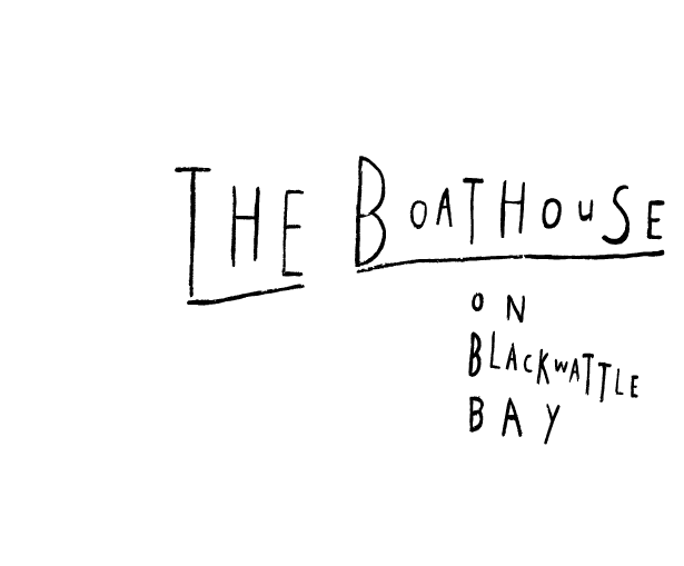
The Boathouse on Blackwattle Bay is one of Australia’s leading restaurants with an international reputation for showcasing the finest Australian seafood. Justin was asked to redesign this long established restaurants’ logo, menus and stationery. “What makes this venue so special is the serene and simple, honest dedication to seafood”, says Justin. Sometimes the best ideas come from things found – as was the case with the logo, which was inspired by the handwritten typography; as could be imagined on a blackboard; advertising the day’s catch. Continue reading

BRAND IDENTITY | Kennards

As can happen with established companies that are both large and successful, Kennards Hire’s identity had become tired and dated. The brief was to create an identity abreast of the times and that could be applied to everything from ‘ladder to loo’. The largest component was the application of the new brands’ internal and external signage system. The project was complete in under 18 months across 170 stores. Continue reading

BRAND IDENTITY | Luton

Luton is Canberra’s largest privately owned real estate business, boasting a network of seven offices. On the cusp of future growth, our task was to rebrand the company and rekindle local love and attention for this much awarded business.
The company name Richard Luton Real Estate was shortened to Luton and an entirely new identity and toolkit of elements was created. The circle was the centrepiece of the new logo design, symbolising wholeness, oneness, completion, perfection and well-roundedness whilst also representing some of the companies core values – being part of a circle of influence and amongst a circle of friends.
The change had a resonating effect with the local property market, with the agency now becoming the agency of choice to sell, buy and lease, particularly gaining traction within the premium market. Continue reading

BRAND IDENTITY | Gilbert + Tobin